
5 Fixes for Common Nonprofit Website Mistakes
#1. Your Homepage Fails the Five-Second Test
Try This Test
Show your homepage to a stranger for five seconds. Then close it. Ask three questions:
- What does this organization do?
- Who does it help?
- What should I do next?
If they cannot answer all three, your homepage fails the test.
What Most Homepages Do Wrong
Many nonprofit homepages say something like “Empowering Communities Through Transformative Solutions.” They show a skyline photo and a “Learn More” button. The visitor sees a vague phrase, a generic photo, and a button that promises more vagueness. They leave.
How to Fix It in Three Steps
- Change the headline to plain language. Example: “We Provide Emergency Food Assistance in Bududa.”
- Change the photo to your real work. Show a volunteer packing a box. Show a family receiving groceries.
- Change the button to “Donate Now,” “Volunteer Today,” or “Get Help.”
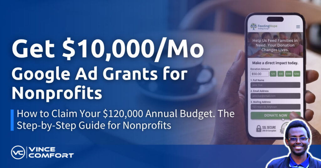
#2. Your Donation Page Has Too Many Fields
Every field you add can cost you donors. The average nonprofit donation form has seven fields: name, email, phone, address, employer, referral source, and card. Many donors leave at field four.
Cut the Form Down
Cut it to three groups: name, email, and payment details. Payment details include the card number, expiration date, and security code. That is enough to start.
Do not ask for more unless you truly need it:
- No address unless you mail receipts.
- No phone unless you plan to call.
- No employer unless you match gifts.
- No referral source unless you track it.
Pro Tip: If you need more information, ask after the gift. You can collect it in a thank-you email or during a thank-you call if the donor shared a phone number.
Test the Shorter Form
A literacy nonprofit in Denver tested a seven-field form against a three-field form. The three-field form got 60% more completed donations. The extra data they “needed” was never used. They now collect the rest during the thank-you call.
Add Trust Signals
Put trust signals right next to the button. Use real signals that fit your nonprofit. Examples include a GuideStar seal, a Charity Navigator rating, your EIN (tax ID), or “Secured by Stripe.” Make the button say “Donate $20 Now,” not “Submit.”
#3. Your Site Does Not Work on Mobile
More than 60% of your visitors use phones. But many nonprofit websites are built and tested on desktop computers.
Check Your Own Phone
Pull out your phone right now. Open your site. Ask yourself:
- Can you read the headline without zooming?
- Is the button big enough for a thumb?
- Does the form work with a phone keyboard?
- Does the page load in three seconds?
Fix Every Tap, Scroll, and Load
Test your site on your phone. Not an emulator. Use your actual thumb on your actual phone. Fix every tap, scroll, and load that feels wrong.
#4. Your Content Answers Questions Nobody Asks
Your blog posts may say “Our Annual Gala Was a Success,” “Board Welcomes New Members,” or “Executive Director Attends Conference.” But your donors search for things like:
- “how to donate food in Karamoja”
- “free legal aid for immigrants in Yumbe Refugee camp”
- “volunteer opportunities for teenagers this holidays”
Find Real Search Questions
Open Google Search Console. Click the queries tab. Sort by impressions.
Impressions are the number of times your site appeared in search results. This shows your biggest content opportunities. Those are the exact words people type to find you.
Each query can become a content title.
Write Simple, Helpful Posts
If people search “how to donate food in Karamoja,” write “How to Donate Food in Karamoja: Three Easy Options.”
If people search “free legal aid in Yumbe Refugee camp,” write “Free Legal Aid in Yumbe Refugee camp: What You Need to Know.”
Write two posts a month. Use the exact query as your headline. Answer in two sentences. Then give steps, options, local advice, and a clear action.
You can also use a tool like Yoast SEO to check basic SEO. Green lights are a helpful guide, not a guarantee.
#5. You Do Not Track What Matters
You may track page views, bounce rate, and time on page. None of those pay the bills.
Track These Three Things
- Organic sessions month over month. Organic sessions are visits from search, not ads.
- Goal completions: donation page visits, volunteer signups, newsletter subscriptions, and event registrations.
- Revenue per organic visitor.
Review Every Month
Review the first Monday of every month.
- If organic sessions rise but goal completions fall, your content may attract the wrong visitors. Adjust your topics.
- If goal completions rise but organic sessions are flat, your conversion improved. Double down on those pages.
The Five Fixes in One Afternoon
You may not need an agency. You may not need a developer. But you may need help from whoever manages your website. Start with one focused afternoon.
- Hour one: Fix the homepage headline, photo, and button.
- Hour two: Cut the donation form to three groups. Add trust signals.
- Hour three: Test on your phone. Fix every tap, scroll, and load.
- Hour four: Open Search Console. Rewrite two headlines to match queries.
- Hour five: Set up goal tracking in Analytics for donations, volunteer signups, and newsletter signups.
The Compound Effect
Fix one mistake. Measure. Fix the next. Measure.
The headline fix compounds. The donation form fix compounds. The mobile fix compounds. The query-based content compounds. The tracking fix compounds.
The nonprofit that starts today owns the results tomorrow. If you need help with your website and content, Book a free website consultation
Common Nonprofit Website Mistakes – Frequently Asked Questions (FAQs)
Q: How do I know if my homepage passes the five second test?
A: Show your homepage to someone who has never seen it for five seconds then close it. Ask them what the organization does who it helps and what they should do next. If they cannot answer all three it fails.
Q: How many fields should a donation form have?
A: Three. Name email card. Every extra field lowers completion rates. A literacy nonprofit tested seven fields vs three fields. The three field form got sixty percent more completed donations.
Q: Why is mobile optimization critical for nonprofit websites?
A: Over sixty percent of your visitors use phones. If your form requires pinching and zooming if your button is not thumb sized if your page loads slowly you lose the majority of your traffic before they engage.
Q: How do I know what content my donors actually want?
A: Open Google Search Console. Click the queries tab. Those are the exact words people type to find you. Each query is a content title. Write posts for the queries with high impressions and low clicks.
Q: What metrics should a nonprofit website track?
A: Track organic sessions goal completions and revenue per organic visitor. Page views bounce rate and time on page are vanity metrics. Outcomes pay the bills.
Q: Can I fix these mistakes without a developer?
A: Yes. WordPress Squarespace Wix let you edit headlines photos buttons forms mobile view analytics without code. The development director at a food bank in Ohio did it during lunch breaks.
Q: How often should I review my website metrics?
A: Monthly. First Monday of every month. Organic sessions goal completions revenue per organic visitor. Adjust your content and fixes based on what converts.